Below is the story board animatic;
Saturday, 26 February 2011


Friday, 25 February 2011
Font Analysis
Analysis of fonts, we analysed two major different types of fonts, 'Serif' and 'San-Serif'.
Using two film posters, it helped us understand what sort of film it is.
For Example:
The film 'Rocky' had a 'San-Serif' font - which are more typically used for headlines than for body text. They don't have the serifs at the ends of letters.
which was also in:
BOLD
(which told us that he was brave),
BLOCK CAPITAL
(this told us that he was a strong person).

However, the film 'Pearl Harbour' had a 'Serif ' font - which are widely used in traditional printed material such as books and newspapers. They are semi-structural details on the ends of most letters.
which was also in:
CAPITAL LETTERS
(which gives a sense of organisation, just like in the army)

Tuesday, 15 February 2011


Sunday, 13 February 2011
Thriller planning (ideas)
The are many differnt ideas in mind for the filming of my thriller opening, I have in mind different sub genres openings such as;
(Idea:1) The opening begins with shots of a person sitting on a floor of check tiles in the kitchen rocking back and forth, we suddenly see everything from the main character/protagonist view, we see constant flash backs of a murder and rape upbeat scary music plays, blood smears all over the front screen of camera and titles/credits appear. (Psychological thriller sub genre)
(Idea:2) We see constant flashes of the seven wonders of the world, a classic opening, up a sky scrapper down the building and pass the receptionist we suddenly bump into the main character who trembles in fear blood smeared on his hand on the run and police sirens everywhere. We see detailed shots of weapons adorned on the characters body, opening suddenly take a flash back in time. (Action thriller sub genre)
(Idea:3) We see a group of men who look suspicious waiting eagerly all targeting towards one perspective a man approaches them group surrounds him. Suddenly the group take a u turn and face a member in the group target him, constant flah backs appear we see the group member on the floor covered in blood, culprits wash blood off their hands, check whether group members dead and leave him to die. New seeting group member is alive on search/hunt for revenge. (Conspiracy thriller sub genre)
Thursday, 10 February 2011
Evaluation of the Prelim
Although i personally believe that my and my groups Prelim has shown a great outcome, i personally feel that improvments are visible in the production.
The actuall Prelim was shot inside the college using the use of the college lift, which resembles a consistency from the bag swap. Our prelim was fairly short, with basic surroundings and action. We included only two characters who share a short conversation between themselves.
Improvements which could have been made if more timing was allowed:
- Would have payed more attention to little details regarding Mis en scene.
- Would have tried to include more shots making the actual Prelim duration fairly longer.
- Would have included a much interesting conversation between the two characters/actors
- Would have included a much more upbeat editing, including sounds/special effects.
Monday, 7 February 2011
Font Analysis
Font is a major presentation technique when it comes to media.
The two main types of font styles are explained below:
Sans-Serif: To sum it up sans-serif is typography that doesn't contain the little tips at the end of each letter [T] and is mainly used for emphasis.
An example of a film using sans-serif is ROCKY.
Serif: thought to be originated from the roman alphabet. Serif is typography the does have the extra detail of the tail on the ends of each letter. This typography is usually used in magazines and newspapers such as "THE TIMES", hence the font called "TIMES NEW ROMAN".
An example of a film using serif is PEARL HARBOR.
The two main types of font styles are explained below:
Sans-Serif: To sum it up sans-serif is typography that doesn't contain the little tips at the end of each letter [T] and is mainly used for emphasis.
An example of a film using sans-serif is ROCKY.
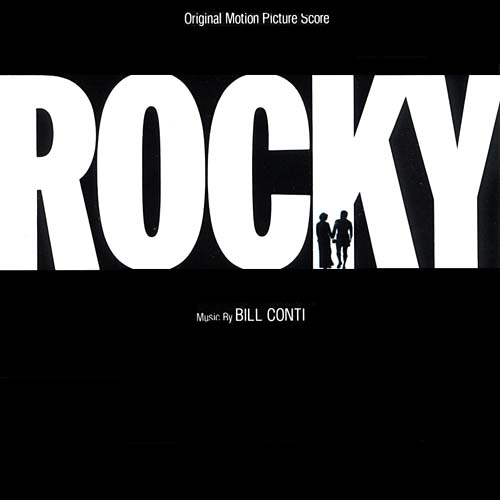 |
| Rocky uses sans-serif for emphasis of the words "ROCK", to show the strength, braveness and power of the main character and because although it is tough and big it looks friendly because it is easy to read. |
An example of a film using serif is PEARL HARBOR.
|
| Pearl Harbor uses serif to show the authentication of tradition and social class. |
Friday, 4 February 2011
Thursday, 3 February 2011
Preliminary, (Animatic)
We as a group were given a task to produce a practice film using the use of Jelly babies as our cast. Our film is set in the college and uses the concept of the college lift, simmilar to our bagswap. The concept of our film is that the yellow jelly baby arrives from the lift out on to the first floor where he/she walk towards the stairs leading to the second floor and bumps into a fellow friend where they exchange a few words, about college routines.
We had a a variety of jelly babies to chose from as you can see below;

We in the end chose to use a yellow and a red jelly baby.
Below are images before the shooting of the animatic;


Below are some screen shot images of editing the Animatic in Final Cut Pro.

The above is a screen shot showing the time series of the animatic it has all the preferred footage in to one sequence

The above is a screen shot showing the number of shot clips we had produced to combine in to one final production.

The above is a screen shot of the far top left hand side screen where combined footage can be viewed as one final production.
Wednesday, 2 February 2011
Thriller audiences
Each individual person has different preference in what kind of a thriller movie they prefer. Many people have different taste which the film industry have tried to match through the use of different thriller movie genres. For instance males may prefer movies which include action where as females may prefer comedy/ love movies.
In 2009 an astonishing number of films were released to be precise 503.
Below is an image of the differences that is mainly appeared in the taste of movies between the two genders.

In class we were asked a series of questions to answer about thriller audiences. such as;
1) How many suspense films were released in 2009? How many films were released all together last year?
There were 503 films released last year which of 31 were suspense thriller.
2) Action, animation and comedy account fro 52% of Box Office in the UK in 2009. Why do you think these genres are so popular?
I think these genres are so popular because the majority of cinema viewers are mainly teenagers, young adults in their early twentys or young children from the ages of 6.
3) Why do you think thrillers account for quite a low proprotion of UK Box Office takings (4% in 2009)?
I believe that thrillers account for quite a low propotion of uk box office takings mainly because as i have stated above most cinema goers are mainly teenagers and young children who are restricted from watching thriller movies either due to their parents moral beliefes or because of the age restrictions/certificate on the movies.
4) Looking at the 'genre by gender' diagram above, what information can be derived about Thriller audiences and gender?
From looking at the diagram above we can tell what genre appeals to what sex as you can see above thriller is stated to be more attractive towards the male audiences as they would possibly prefer action and crime related movies where as the female audience would prefer romance and period based movies as shown above. Both genders however seem to prefer comedy related movies, which is why comedy movies took an astonishing 20.5 percentage of box office figures last year (2009) and the highest gross of £219,228,278
5) Look at the age certificate for 10 of the films featured on the teaching blog. What does this tell you about Thriller audiences?


Looking at the age certificate for the ten films above we can tell that all these film are targeted at a specific age group which is in this case 15 apart from Jaws which is PG and Marathon man which is 18. We can also tell that the movies that are certified as 15 are films remotely based on crime and violence which is implied from the text, images and the name of the film in the posters above, we can use this to prove that the main reason why thriller movies count for such a low UK box office is because they have a age certificate that is aimed away from children and teenagers below the age of 15, who are the most cinema goers who attract parents and gudians with them.
Tuesday, 1 February 2011
watching documentary
In class we watched a short documentary on film openings, and the way they are effective. There are a range of different film openings such as; opening with details of all the people involved in the production, opening with the ending of the movie and showing flashbacks of past occurence or even opening with just the movie and leaving the titles to the end. There are also a range of paces that film openings can use, such as fast up beat openings with music/theme tunes or with a loud bang of action, by avoiding all these specific elements films can start on a slow pace, which can also be quite effective as simmilar to having an loud visual opening.
Whilst watching the short half an hour or so documentary we were all asked individually to answer certain questions shown below.
1)What does Thomas Sutcliffe mean when he says "Films need to seduce their audience into long term commitment" , while there are many types of seduction, the temptation to go for instant arousal is almost irresistable.
What Sutcliffe means is that films need to engage there audience as soon as possible, draw the attention of the audience into the film so that they want to watch & know what happens next. Statistics show that a film opening worked best when it hit you in under five minutes. Films with such openings are Touch of evil, casino and many more.
Above is a the opening shot of Touch Of Evil and Casino
2) According to Director Jean Jaques Beineix 'what are the risks of instant arousal'?
Beineix implied that the risk of instant arousal is that films have to live up to the opening, which is quite easy to fade out. When starting the film with an action packed or dramatic opening the audience will have the intention/expectation of something more dramatic, which can usually be hard to deliver.
3) Explain why a "good beginning must make the audience feel that it doesnt know nearly enough yet, and at the same time make sure that it doesnt know too little"?A good beginning must be aware of how much information it gives away of the film as it could possibly reveal the actual concept of the movie, Many people will usually be able to make a gesture or an judgement of what a movie may be about from the beginning of a movie which can possibly tend to bore people as it could be the same story line (etc) as a previously seen movie. However if theres too little information of what a movie is about in the beginning it can also have an affect of boredom, mainly being the cause of confusion.
4) What does critic Stanley Kauffmann describe as the classic opening?
Kauffmann describes a classic opening being one that starts with an establishing shot of New york city, then up a skyscraper pass an receptionist and finally taking us into a close up of a character taking the audience into the everyday life of an specific character.
5) Why is Kyle Copper's title sequence to the film seven so effective?
Copper's 1995 thriller film Seven sequence was so effective because it tuned the audience to the right pitch of the movie and set the public up for the movie ahead so that they knew what kind of a film they were viewing. In other words it foreshadows later events. Below is the actual title sequence of seven
6) What did Orson Welles want to achieve with his opening to the film A Touch Of Evil, and what did Universal studios do to it?
Welles wanted to ignore the whole classic opening and begin the film from a point where he could plunge the audience in to the movie without using titles/credits. He chose to do this by filming the opening in one take. However Universal studios decided they werent going to let this happen as they wanted their name to be noticed and so went on to applying titles and sound to the original opening.
Below is the original opening of Touch Of Evil without Titles and sound exactly how Welles intended.
7) What is meant by "a favourite trick of Film Noir"?What is the trick?
The trick of Film Noir is the ending of the film appearing in the beginning. In other words the film starts with the ending of the film and refers back to the past/ goes back in time ( beginning).
8)
How does the opening to the film 'The Shining' create suspense?
The opening of The Shining, creates suspense with the use of visualy showing the camera following from a high end like an predator. In The Shinning we see a car presumingly going to a very bad/dangerous place, which is able to be gestured from the use of the setting of the mountains in the far end corner, with the visual opening scene a very frantic music is accompanied which in all adds to the suspense.
Below is the opening of The Shinning;
structure of openings
The opening of a film plays a crucial in engaging and attracting the proposed target audience. There are a range of structure openings for example;
Discrete title sequence: A title sequence in which the titles appear in different backgrounds, separate from the opening clips. in other words they are heavily edited and stylished.Example's of such a film is Enemy of the state. Below is the opening title sequence of Enemy Of The State in which the title sequence's appear in a different background (New york city) from the actual opening of the film.
Stylished editing: opening which uses special effects to create a intrigue in attracting and engaging the target audience. An example of such a film is Mezrine, below is the actual opening of Mezrine.
Narrative opening: An opening of a film with titles running through it. We are introduced to locations, settings and then characters. In certain circumstances even to the main/key character, examples of such films are : The Shining. in which the camera follows like a predator. Below is the opening of The Shining;
Discrete title sequence: A title sequence in which the titles appear in different backgrounds, separate from the opening clips. in other words they are heavily edited and stylished.Example's of such a film is Enemy of the state. Below is the opening title sequence of Enemy Of The State in which the title sequence's appear in a different background (New york city) from the actual opening of the film.
Titles over blank screen: Titles running through a blank screen, in which only the text is visual. In such openings often sound effects or sound are include An example of such a film is Memento. Below is the opening of Memento in which only the title are visible.
Stylished editing: opening which uses special effects to create a intrigue in attracting and engaging the target audience. An example of such a film is Mezrine, below is the actual opening of Mezrine.
Font analysis
Font plays a cruical part for a movie, it allows the target audience/public make an assumption/guess what the actuall movie genre is. Font come in all different sizes and shapes and can be used espically in the film industry to engage and attract the public. There are a range of font designs to suit every genre, whether its comedy,horror or action.
Most movie posters include either one of the below font styles.
Below are images of past movie posters and details about the font used.

The use of this font style creates the assumption that this is a movie including a range of violent activities, which is common in all Rocky's movies. This particular font style and size represents rocky's personality and charismatic attitude alongside with matching his physical appearance.The use of such font also suggests that Rocky is/should be seen as an authority figure, who people look up to.

Most movie posters include either one of the below font styles.
· Serif fonts (times and courier)
· Sans Serif (Ariel and Comic Sans)
Below are images of past movie posters and details about the font used.
The use of this font style creates the assumption that this is a movie including a range of violent activities, which is common in all Rocky's movies. This particular font style and size represents rocky's personality and charismatic attitude alongside with matching his physical appearance.The use of such font also suggests that Rocky is/should be seen as an authority figure, who people look up to.
Rocky is a movie remotely based on the issue of boxing which requires a use of a font style which represents the same concept. The font style in the above Rocky poster is 'Franklin Gothic Medium'.
The fast and the furious is more of an movie remotely based on cars, It is an action movie where the title of the movie suggests an obvious assumption that this is a movie that will take you on a fast ride. the font is in itallics and has a touch of a fade which suggest the speed of the movie. I havent been able to match The font style of the movie poster but it seems to be match quite a lot with the font style rockwell extra bold
Subscribe to:
Posts (Atom)